In this Drupal Tutorial I will show how to add a new HTML in Drupal 7 head section.
I'm using responsive design to enable my blog work pretty ok on mobile devices, but yesterday looking through Google PageSpeed Insights suggestions I found that there is no viewport defined, so it might not render CSS as I might want, but instead to scale webpage to device.
Your page does not have a viewport specified. This causes mobile devices to render your page as it would appear on a desktop browser, scaling it down to fit on a mobile screen. Configure a viewport to allow your page to render properly on all devices.
What is the solution for Drupal 7?
I did a quick Google search, and found webomelette article with solution.
I added to my Drupal theme template.php following function:
function YOUR_THEME_preprocess_html(&$vars) {
 $viewport = array(
 '#tag' => 'meta',
 '#attributes' => array(
 'name' => 'viewport',
 'content' => 'width=device-width, initial-scale=1, maximum-scale=1',
 ),
 );
 drupal_add_html_head($viewport, 'viewport');
}
Change YOUR_THEME to name of your theme, save the file, clear the cache and you should have viewports defined in your Drupal 7 <head> section.
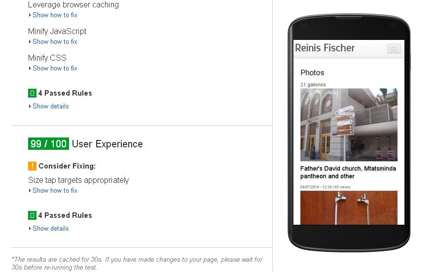
You can go check it with Google PageSpeed Insights, to see if it is working.
P.S. If you are considering a hosting for your Drupal website check out Bluehost, their shared hosting starts as low as $3.95/mo or read more about cheap Drupal hosting.