Working on the OptionsBrew.com project (website is powered by Drupal 8) I faced the following responsive table issue while browsing content with a table on smaller screens (phone)
Broken Table on a smaller screen
Luckily there is a simple CSS workaround:
in the .css file add the following to table properties:
   display: block;
   overflow-x: auto;
like this:
table{
border-collapse: separate;
border-spacing: 0;
width:100%;
margin: 25px 0 40px;
display: block;
overflow-x: auto;
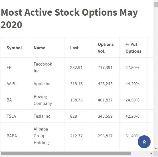
}here is how it looks now

Responsive table
You can see a live example here: Top 20 Most Active Stock Options May 2020